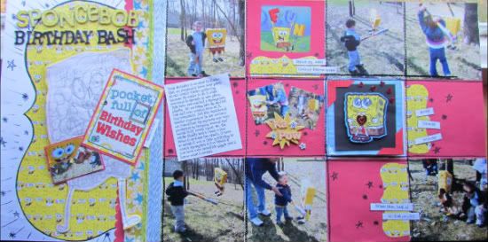
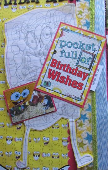
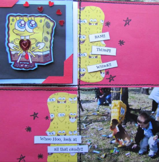
The flap and Spongebob drawing are the other variations I made to the page. I wanted to keep his drawing he did for his Birthday that year and incorporate it into the page so I used it in place of the 5 x 7 pic. This worked well because it's roughly the same size.
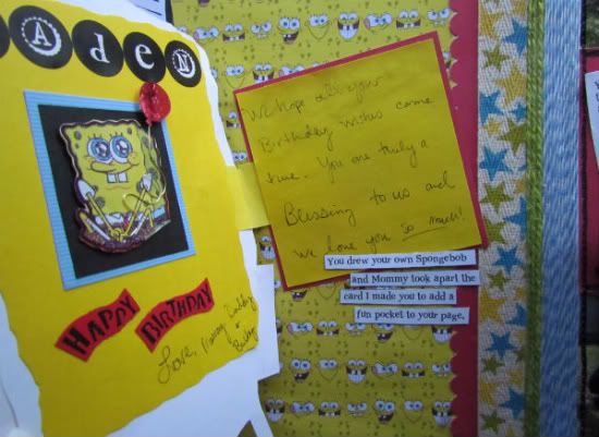
I added a sticker and another small photo here as well. I made this area a moveable element with a hinged area that you can lift for more journaling and memorabilia.
Next I put my squares in place along with the 4 x 4 photos. I did add an embellishment in place of one of the pictures on the right side.
It was from the Birthday card I made him that year. I also added another part of the card under the flap on the left side.
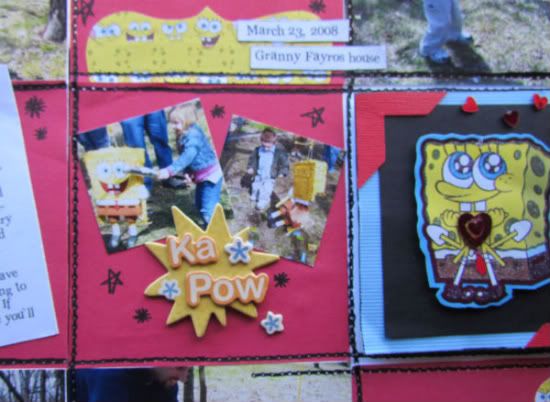
I kept with the 4 x 4 pics and squares for the others with exception of one. On the square next to the journaling box I added two small square pics and an embellishment on top of a 4 x 4 square.
This allowed me to add more pictures and follow the theme of the layout with the "KA POW" sticker without really messing up the overall 4 x 4 design.
Because my papers were so themed and specific, I didn't have a coordinating group to pull other patterns from. Instead I used twine and twill ribbons in place of the pattern paper strips and stripe. They also helped me pull in more colors that coordinated with the pictures rather than my main diecut papers.
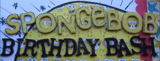
The overall theme of the layout was lots of animation and movement. I wanted it to have a child-like cartoon feel to it and so there are little "doodles" and very graphic bold faux stitch lines. It's not meant to be exact, which is not my norm, but was definitely more fun and less stressful making! I didn't worry about it all being just right, I had more fun with it. I love it when my actual photos inspire me! I would have NEVER doodled and such on a layout before so this was a teeny step out of my usually very organized box!
No comments:
Post a Comment